The MACD has an intimidating name — Moving Average Convergence Divergence — that does a great job of hiding how simple it is. Underneath, the MACD is the distance between two moving averages, plotted as a line. That’s the core of it. Everything else is decoration on that one idea. Let’s do the math.
The one-sentence job
The MACD measures momentum by tracking how far apart a fast moving average and a slow moving average are. When a fast average pulls away above a slow one, price is accelerating up. When they squeeze together and cross, momentum is shifting. The MACD just turns “how far apart are these two averages” into a single wiggling line you can read at a glance.
The three pieces
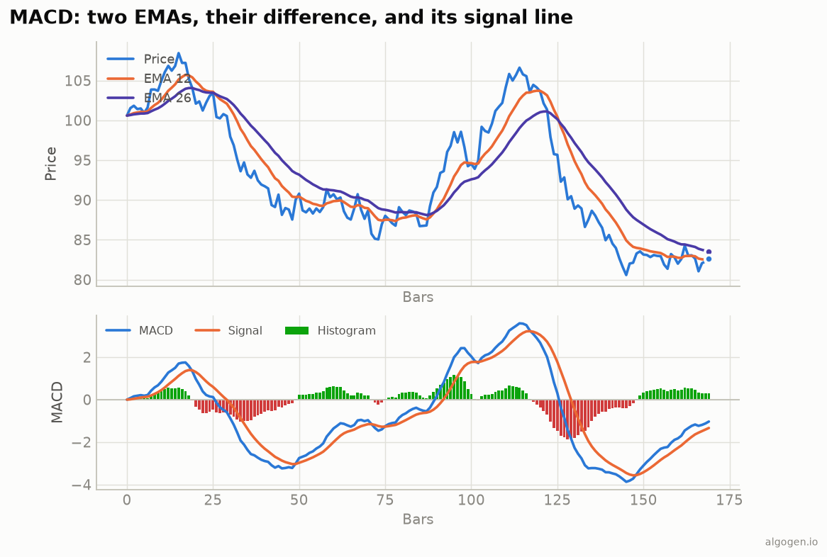
Look at the bottom panel of the chart above. There are three things going on, and the standard settings are 12, 26, 9:
- The MACD line = EMA(12) − EMA(26). The 12-bar exponential moving average minus the 26-bar one. When the fast EMA is above the slow EMA, this line is positive; when below, negative. It’s literally the gap between the two orange/violet lines in the top panel.
- The signal line = EMA(9) of the MACD line. A smoothed version of the MACD line itself — a moving average of a moving-average difference. It lags the MACD line and is used to generate crossover signals.
- The histogram = MACD line − signal line. The bars. When the MACD line is above its signal, bars are positive (green here); below, negative (red). The histogram grows and shrinks before the two lines actually cross, which is exactly why it was added (more on that in the history).
How to read it
Zero-line crosses. When the MACD line crosses above zero, the fast EMA has crossed above the slow EMA — a classic trend-turning-up signal (and vice versa). This is the slowest, most trend-following read.
Signal-line crosses. When the MACD line crosses above its signal line, momentum is turning up; crossing below, turning down. Faster than the zero cross, and the most commonly traded MACD signal. On the chart, these are exactly the points where the histogram flips from red to green or green to red.
The histogram as an early warning. Because the histogram is the gap between MACD and signal, it starts shrinking while the trend is still going — a tell-tale that momentum is fading before the actual cross. Traders watch for the histogram to stop growing as a heads-up.
Divergence. If price makes a higher high but the MACD makes a lower high, the new high had less momentum behind it. Same divergence idea as the RSI, and same caveat: suggestive, not a guarantee.
The settings
12, 26, 9 are the defaults on every platform. In an era when markets traded six days a week, 12 was roughly two weeks and 26 roughly a month — the numbers stuck long after the trading calendar changed. Shorten them for a twitchier MACD on fast timeframes; lengthen them to calm it down. As always, the settings are a starting point, not scripture — test before you trust.
Where it lies to you
- It lags. The MACD is built from moving averages, so it inherits their lag. It confirms moves; it doesn’t call tops and bottoms.
- Whipsaws in chop. In a flat, trendless market the MACD and signal lines tangle around zero and every crossover is noise. The MACD is a trend tool; in a range it just chops you up.
- Unbounded scale. Unlike the RSI, the MACD has no fixed 0–100 range — its values depend on the price and volatility of the instrument, so you can’t compare MACD readings across different assets directly.
The MACD isn’t magic. It’s a clean, readable summary of the tug-of-war between a fast and a slow average. Used to gauge whether momentum is building or fading, it earns its place. Used as a blind buy/sell buzzer, it’ll donate your money to the market with great efficiency.
Now go test it, don’t trust it
You now understand every line on that chart, which means you never need to pay for a MACD. The move is to find out whether a MACD rule actually beats holding the asset, after costs. Drop a signal-cross rule into AlgoGen and read the equity curve. Then build it yourself in Python, MQL5, Pine Script, EasyLanguage, or NinjaScript.
This post is educational, not financial advice. Indicators describe the past; they don’t predict the future. Backtest anything before you risk real money on it.
Sources and further reading
- Gerald Appel (CMT Association)