Bollinger Bands look sophisticated — three curvy lines that hug price and breathe in and out — but they’re a 20-period moving average with a volatility measure stapled on top. Once you see that, the mystique evaporates and the usefulness remains. Let’s do the math.
The one-sentence job
Bollinger Bands wrap price in a channel whose width is set by recent volatility. When the market gets jumpy, the bands widen; when it goes quiet, they pinch in. That adaptivity is the entire point, and it’s what separates them from a dumb fixed-percentage envelope.
The formula
There are three lines, and the default settings are 20 and 2:
Middle band = 20-period SMA of close
Upper band  = Middle + 2 × (standard deviation of the last 20 closes)
Lower band  = Middle − 2 × (standard deviation of the last 20 closes)
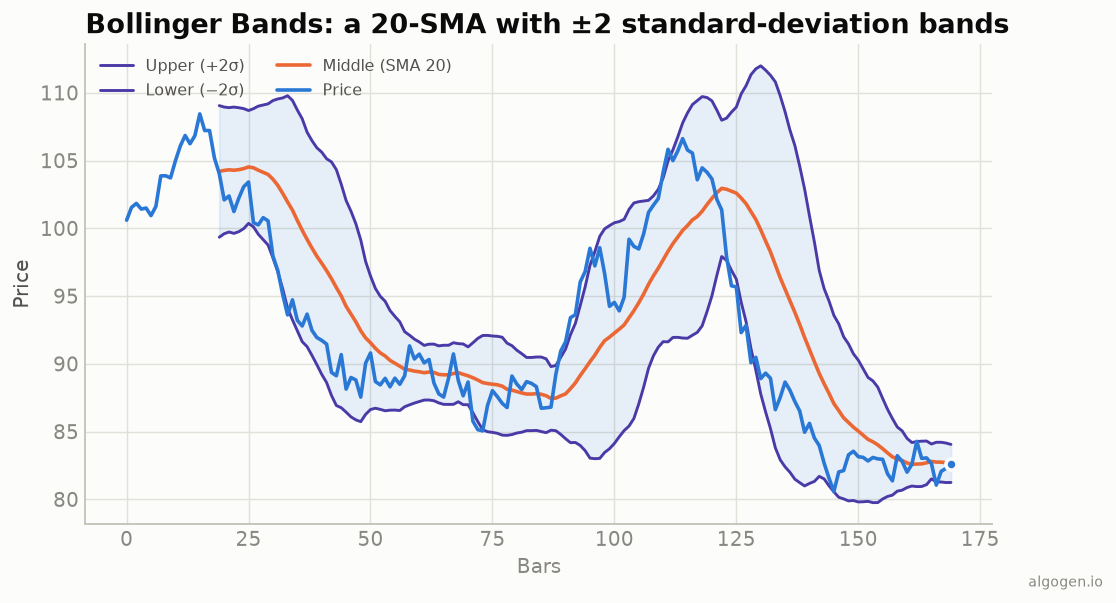
The middle band is just the average. The magic is the standard deviation — a statistical measure of how spread out the recent closes are. When prices are tightly clustered, the standard deviation is small and the bands sit close to the average. When prices are swinging around, the standard deviation balloons and the bands fly apart. You can see it directly in the chart above: in the choppy, fast-moving stretches the channel is wide; in the calm drift near the middle it narrows.
Because bands are two standard deviations wide, a rough statistical rule of thumb says a large fraction of price action will stay inside them — but markets are not tidy bell curves, so don’t treat “outside the band” as a law being broken.
How to read them (properly)
The squeeze. When the bands pinch to an unusually narrow width, volatility is low — and low volatility tends not to last. A squeeze often precedes a big expansion. It doesn’t tell you which way, just that a move may be coming. This is probably the most respected Bollinger signal.
Walking the band. In a strong trend, price will “walk” up the upper band (or down the lower one) for a long time. This is why “price touched the upper band, so sell” is such a good way to lose money in a trend — tagging the band is a sign of strength, not an automatic reversal. John Bollinger himself stresses this.
%b and bandwidth. Two companion readings make the bands quantitative. %b tells you where price sits within the bands (0 = on the lower, 1 = on the upper, 0.5 = at the middle). Bandwidth measures how wide the bands are relative to the middle — the number you watch to spot a squeeze.
M-tops and W-bottoms. Bollinger described reversal patterns where, for example, price makes a new high but fails to reach the upper band on the second push — a momentum warning similar in spirit to divergence.
The settings
20 periods, 2 standard deviations are the defaults, and Bollinger’s own advice is to change them together and cautiously: if you lengthen the average, you generally widen the multiplier a touch, and vice versa. As always, treat them as a sensible starting point and test alternatives rather than trusting folklore.
Where they lie to you
- They’re not a mean-reversion machine. The naive “buy the lower band, sell the upper band” works in a range and gets destroyed in a trend, where price walks the band for weeks.
- Standard deviation assumes nothing about direction. Wide bands mean volatility, not opportunity in a particular direction.
- The ddof trap (for coders). Bollinger uses the population standard deviation. If your code uses the sample version by accident (pandas’ default), your bands will be subtly too wide — a bug we’ll squash in the Python post.
Bollinger Bands are, at heart, an honest picture of “where is price relative to its recent average, scaled by how wild things have been lately.” Used as context — squeeze, band width, position within the channel — they’re excellent. Used as a mechanical touch-the-band buzzer, they’ll teach you an expensive lesson.
Now go test it, don’t trust it
You now understand every line on that chart. The real move is to test whether a Bollinger rule — a squeeze breakout, say — actually makes money after costs. Drop it into AlgoGen and read the equity curve. Then build the bands yourself in Python, MQL5, Pine Script, EasyLanguage, or NinjaScript.
This post is educational, not financial advice. Indicators describe the past; they don’t predict the future. Backtest anything before you risk real money on it.
Sources and further reading
- John Bollinger's official Bollinger Bands reference (Bollinger Capital Management)